Visual Design Part 2: How to Get Better
May 17, 2021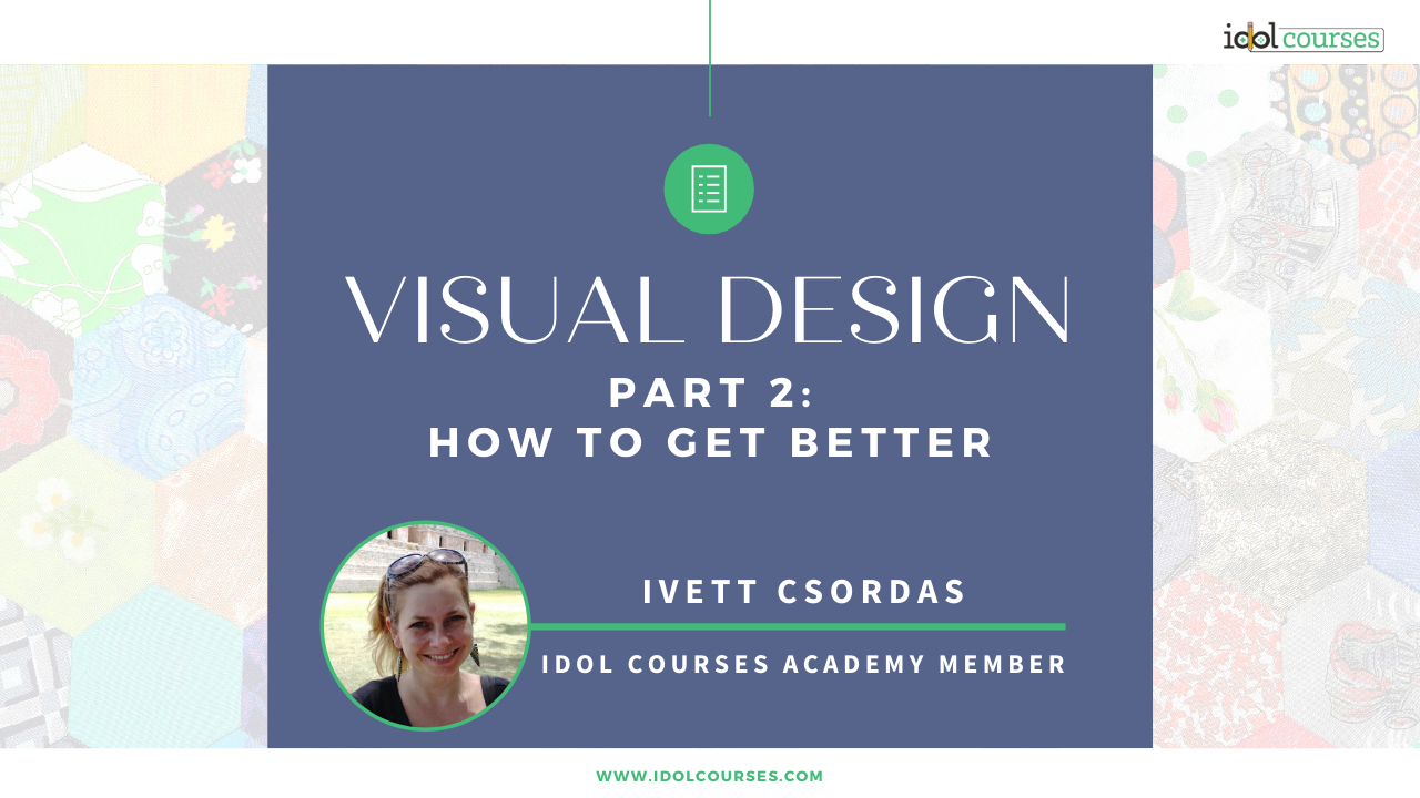

“Instructional Designer? What’s that?” I’m sure you’ve heard that question too. Most people would assume that we are designers working with our palettes and rulers. Well, they’re not far from the truth; we’re not called designer for no reason. We design instruction, job aids and courses because we understand how people learn. And because we understand people, we know that the visual design of these contents is equally important.
In my last blog post, I wrote about the importance of good and accessible visual design and introduced some tips on how to get started. In this post, I will use practical examples to point out what bad and good designs are.

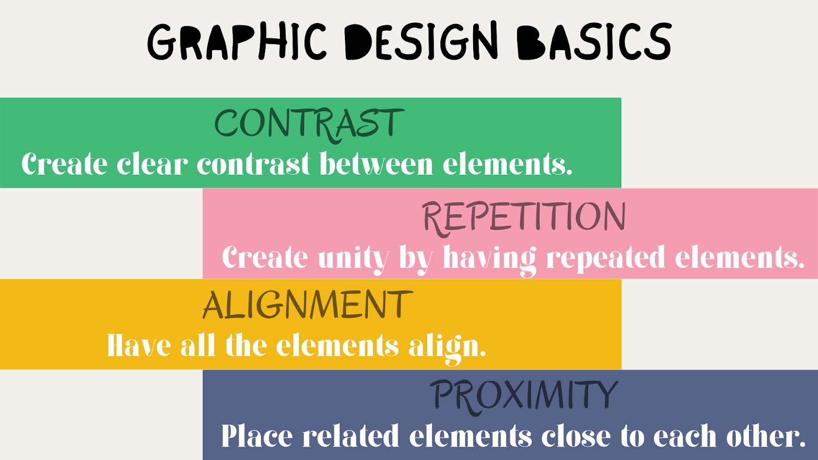
No, I’m not swearing, I’m quoting an acronym from my favourite graphic design book author, Robin Williams from The Non-Designer's Design Book. This page-turner has hundreds of images to point out the differences between amateurish and easily achievable professional-looking creations. I learnt so much from that book in no time and my eyes do not see visual designs the same way as before.
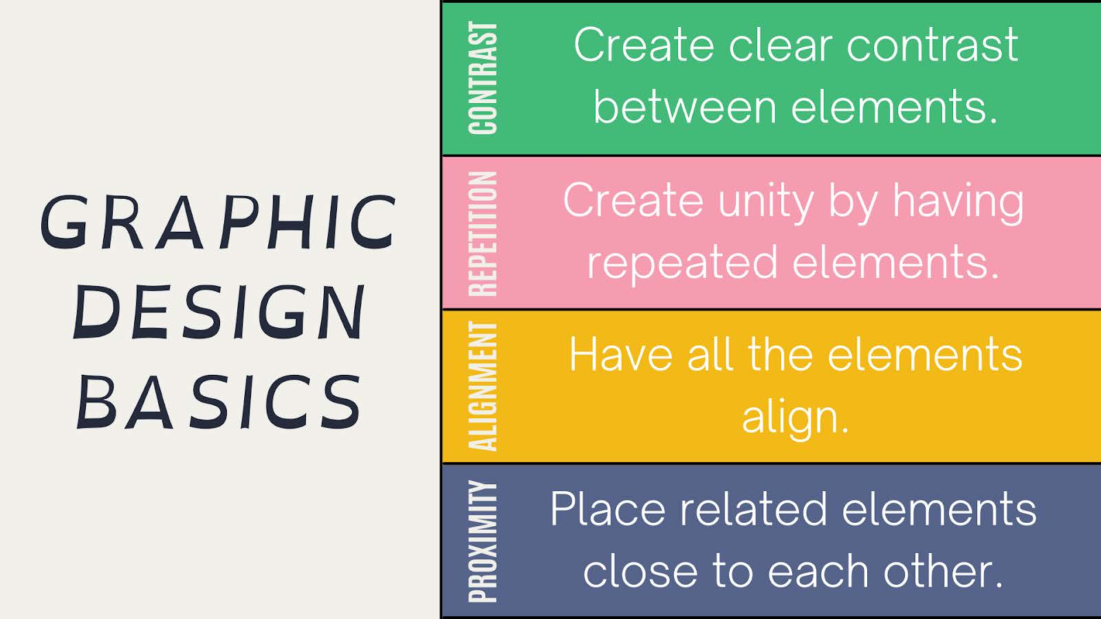
She says that there are four basic principles, CRAP for short, for graphic design. There are of course many theories out there; some would say there are seven principles, some would list even more. However, in the book, she summarises these in 4 categories.
They are:
Contrast,
Repetition,
Alignment
and Proximity.
CRAP.
I won’t go into details - you can read the book. Instead, I will show a few designs.

Observing various graphic designs is probably the easiest and quickest way to become better at visual design. Good designs can inspire us, while bad ones help us avoid making mistakes. In the following slides, I will present both. Play along and identify a few positives and negatives about each design before reading my comments. Watch how they gradually improve. Ready?
1.

Coming from a teaching background, I know that I used to make texts big and fill up the sheet or slide. But this design can’t breathe; there should be some white-, or so-called negative space. It looks crammed and the background yellow is overwhelming.
Not only that, there’s nothing to help direct the eye or draw our attention. There’s a tiny contrast between the upper case subheadings and the content lines, but not enough.
It’s not bad in the sense that it is at least consistent and uses legible fonts and the texts are all aligned, but the colour contrast would not pass the required ratio for legibility.
2.
This is less crammed and the colour balance is much nicer. The biggest issue, however, is in the fonts. There’s too much variety with the three different fonts, not to mention that the title resembles an 8-year old’s notebook. There should only be 2 -3 typefaces used and their “personalities” should match the topic. Besides, the content lines use serif and not a very legible one, which could be a serious issue for some people. It is very much recommended that sans-serif is used for the main content so that we don't make things even more difficult, especially for the learners who might be dyslexic.
Besides all that, the zig-zagged design just keeps dragging the eye from left to right until we don’t know where to start. A good design draws our attention to one point first and then directs our gaze in an organised way.
3.
The fonts have been tidied up. Although there are still three different types used, at least it’s not the font that is going to cause legibility issues.
The issue is the colours here. The subheadings and the icons use a lighter or darker shade of the background colour and therefore the contrast is not visible enough. Especially the “proximity” subheading and the alignment icon melt into the background. It’s important to use contrasting colours to ensure legibility and meet accessibility standards.
As for alignment, the content lines are left-aligned and therefore look neat. However, the subheading lines are still centre-aligned and, as such, break the flow of the page. The icons, on the other hand, are entirely off. Not only do they appear scattered and unorganised, but they also seem too different. Misalignment creates an unprofessional look.
4.
This page finally has negative space on the left. The font used in the title was actually designed for dyslexic people hence why the letters are wider at the bottom.
The issues are on the right side. First of all, it’s not the easiest to read tilted text and we don’t want our learners to sprain their neck while reading subheadings. Also, the centre-alignment does nothing for the content. In her book, Robin Williams constantly says “Don’t be a wimp!”; if you want to create contrast, go and create contrast. If you only do things halfway, they will look like editing mistakes rather than design decisions. If there’s one thing I would pass on to anyone is exactly this and centre-alignment. Centre-alignment is popular, but with a lot of content, it just looks messy and honestly, like inconsistent organisational choices.
One last thing to mention about this design is the “widow”, the lonely last word of “align” in the yellow section. Avoid widows whenever possible.
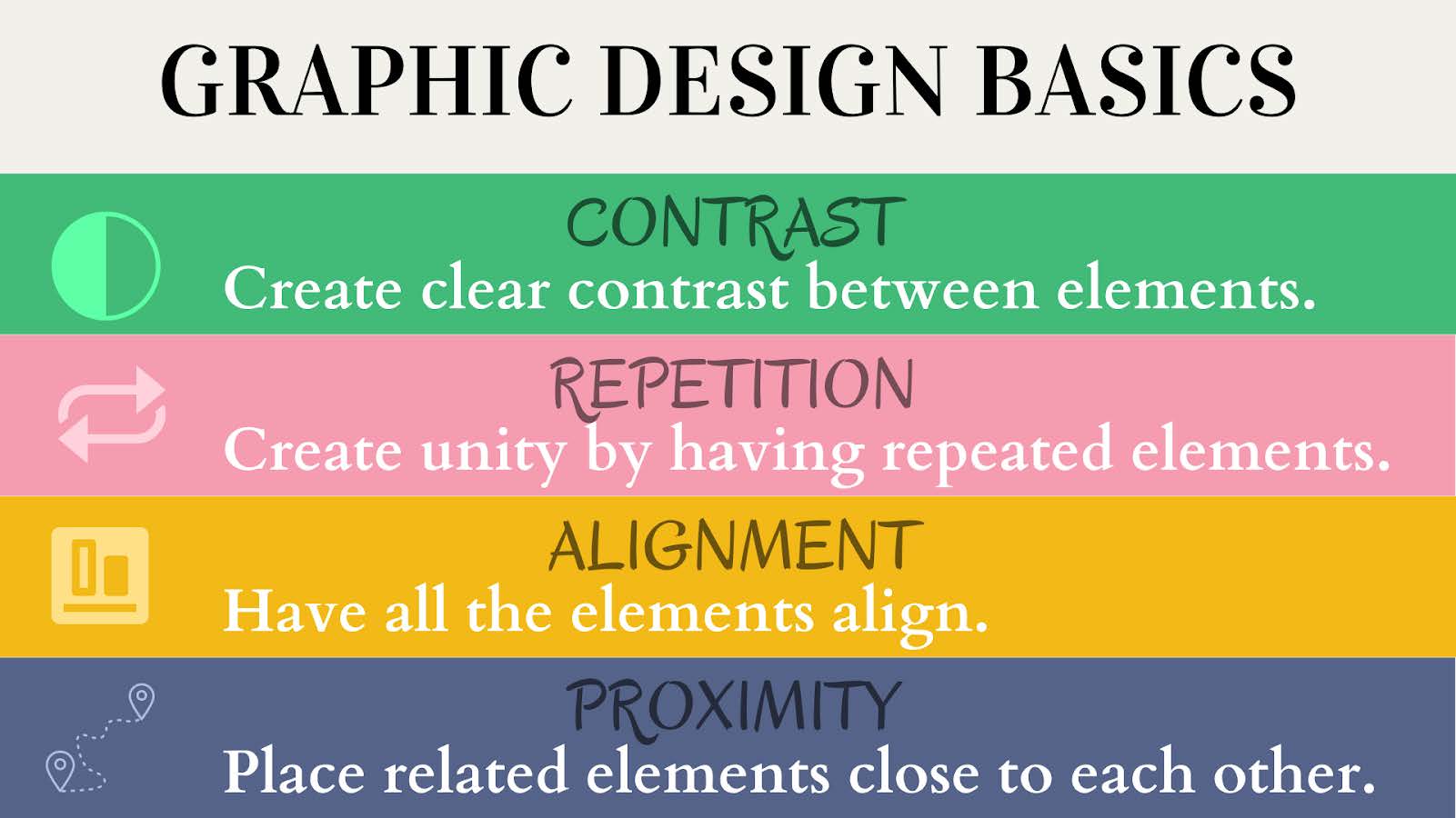
5.
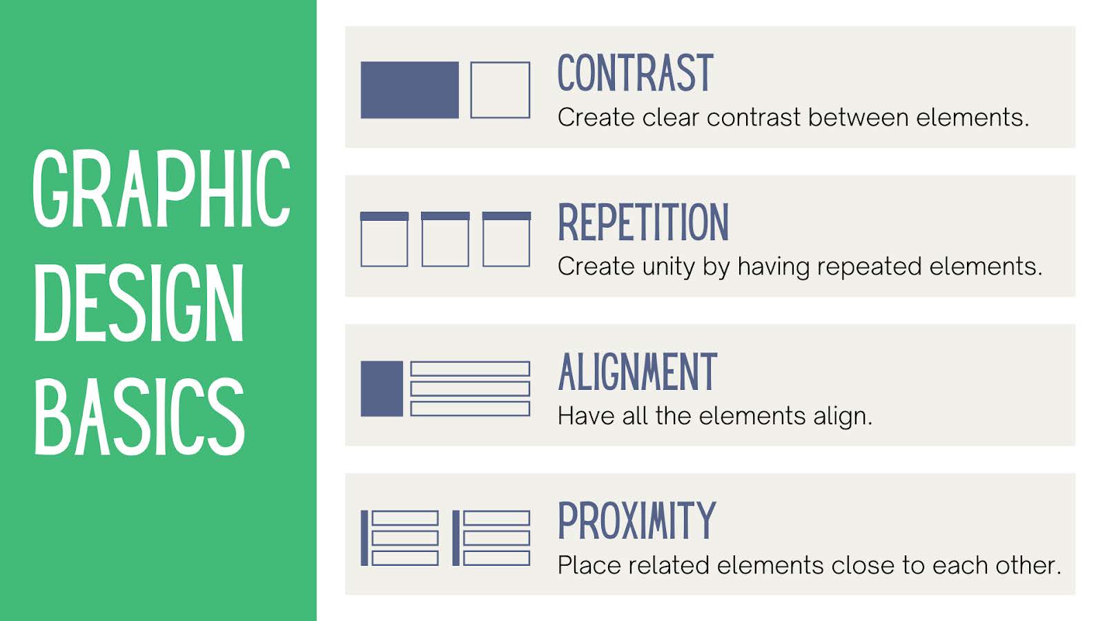
This design might look colourless, but it’s clean and easily comprehensible. I personally agree with those that say that whatever we put on our ‘canvas’ has to have a purpose; everything else is just ‘noise’ for our learners. As a result, I like simplicity and the one thing I am constantly reminding myself of is not to be afraid of white and white space.
In this image, there are only 3 colours, but the content can breathe. The eye is drawn to the title first, due to the block of bright green and then is directed to the rest of the information.
The meaningless and messy icons have been replaced with perfectly aligned visual aids that blend in with the page and yet stand out.
Even though uppercase texts are not recommended due to possible legibility issues, there’s not a lot of them and they create a clear contrast with the other lines.

We started with a very unattractive design and slowly turned it into a clear and useful resource. We didn’t cover everything along the way and there is no way that I, with very limited design skills myself, can ever cover everything. Graphic designers study for many years and this is just one amateur blog post. However, I hope you have been able to pick up many tips and best practices along the way.
The IDOL courses Academy’s library is vast and they offer many lessons on graphic design skills too. Coming from an educational background, I’ve had a fair understanding of accessibility and I even made a sample course for my portfolio on this topic. However, I improved my design skills mainly by creating things, getting inspiration from others and getting feedback. While having a good eye for design is a talent, in my opinion, we can all learn enough to get really competent.

Written by: Ivett Csordas
Ivett is a teacher turned Instructional Designer. She has over 8 years of experience in secondary schools and 5 years in EFL classrooms. As a life-long learner, she is passionate about sharing knowledge and creating meaningful learning experiences. Her niche is breaking concepts down and anticipating potential learning obstacles. Before the pandemic, she loved watching plays in the theatre and going on backpacking adventures. Connect with her on LinkedIn or check out her portfolio.